Using patterned tile is a surefire way to add the zhush to your home’s interior. Mixing up sizes, shapes, and even the direction of tiles can transform even a small space. Floors, showers, and backsplashes are ideal locations for a tile update.
Our J&J design team uses all sorts of tile in our customer’s projects. Although we mention the details in our Project Spotlights, we wanted to share some of the latest pattern inspo to help activate your imagination!
Pop in Some Color
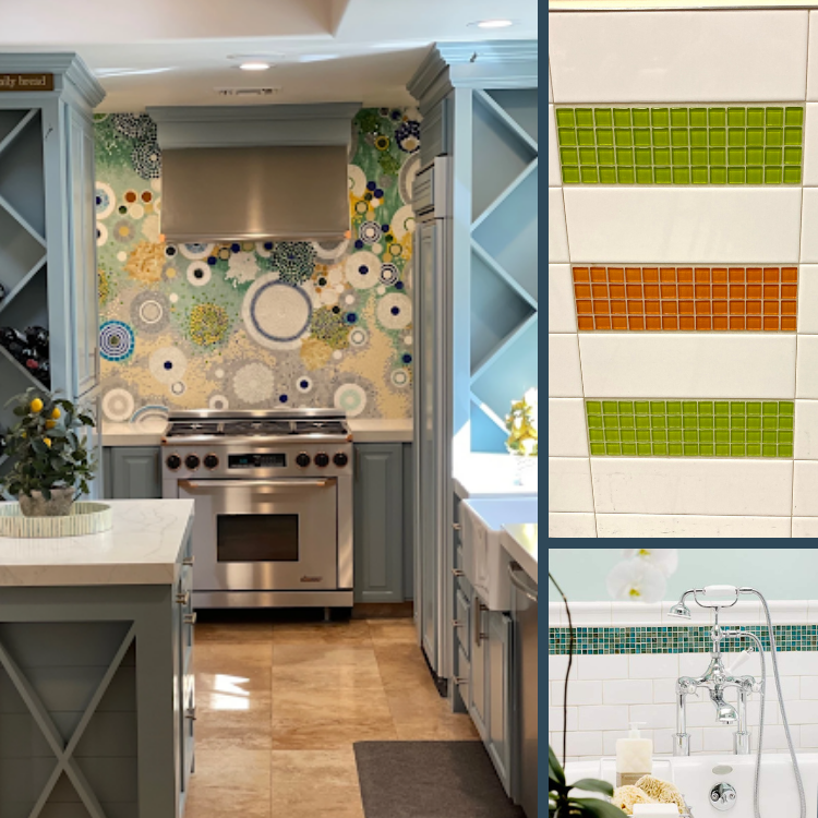
Although the trend towards light, bright, and neutrally colored rooms is here to stay, there’s no need to avoid a little zip of color. Unlike other accents – such as towels or rugs – tile is unlimited as to where it goes.
Using it on a stove backsplash, as a border, or even as a zesty replacement for the occasional white subway tile is an effortless way to pull a room together. A spot of color can help lengthen a room, create a contrast, and break up solid walls. These examples range from subtle touches to big focal points.
Penny for Those Design Thoughts?
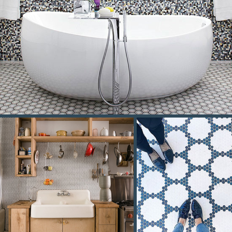
Penny tiles have been around since the early 1900s – but their new uses don’t feel stale! With a full range of colors, the availability of different grout shades, and the desire for fresh pattern looks, they’re so popular!
These easy-to-care-for cuties are perfect for all kinds of applications. As you can see below, their use isn’t constrained by design styles. They look just as marvelous with rustic kitchens and farmhouse sinks as they do with a bold and modern tiled bathroom.
Surprise! Little Touches That Work
Remember that there’s always room for a little embellishment on your next renovation that involves tile. These little details are what make you smile in your daily living – or that bring joy to your guests.
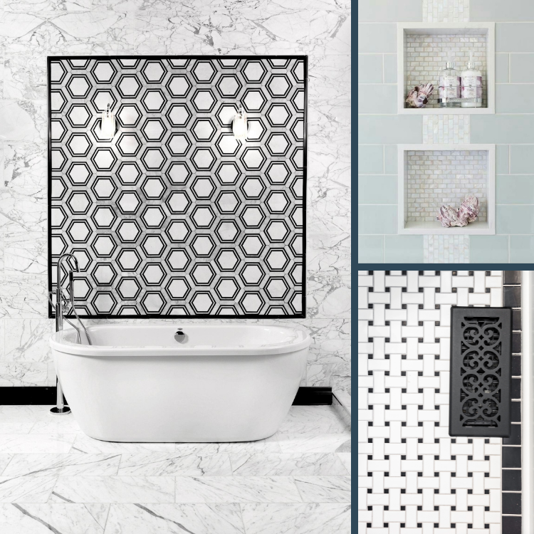
An inlaid marble water-jet cut tile pattern elevates the wall behind this bath’s free-standing tub – adding art where it usually can’t go! A popular design choice with J&J bathroom remodeling customers – a shower inset – takes it up a notch with a textured tile and a bold accent stripe. Last, the floor tiles in black and white benefit from a stunning herringbone pattern and a crisp solid border.
Geometry 101
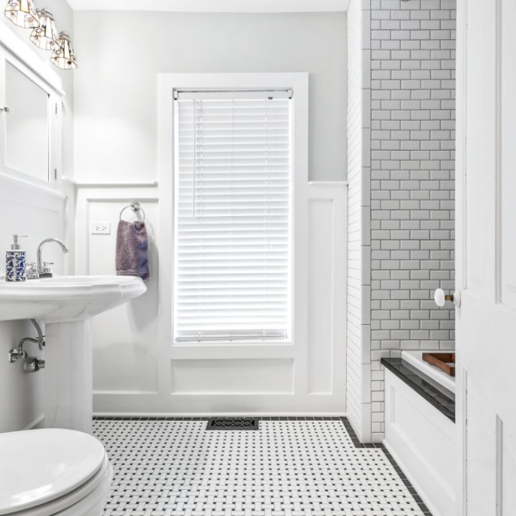
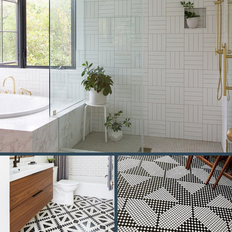
Tiles lend themselves to lots of pattern play. These black and white examples are crisp, sophisticated, and really show off the patterns. Each is a great reminder to break out of the standard dimensions and 90-degree angles when you’re ready to remodel!
Look carefully at those bathroom walls, and you’ll see standard-sized small subway tiles arranged in an alternating grid pattern. It’s subtle, but you’ll notice how it brings new interest to a largely bare space. Below, a strongly patterned tile enlivens a small space and makes a bold statement. Last – we just love the look of the square tiles with a woven effect! It has all the punch of a woven rug, but almost none of the maintenance.
Going Up With Vertical Looks
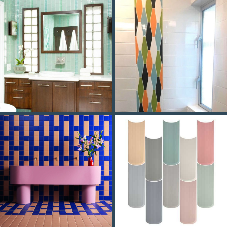
Emphasizing height and drawing the eye upward with vertical lines is a great way to play with proportions. Make small rooms seem airier, kitchens less cramped, and emphasize a high ceiling with tile patterns. Whether through the tile shape or the layout, it’s an easy way to change the look of a new room.
Used on the vertical, the retro-inspired tiles of this shower help brighten the walls and open up the space. Although the color is part of the look, this idea can also be used with same-colored tiles for a more subtle effect – but the same results. Another tile shape is shown below – we love the directional aspects of this design, as well as the soft tones. Our other two examples may look far apart, but they actually employ the same trick of alternating colors and shades to create their uplifting effect.
Playing With Proportions
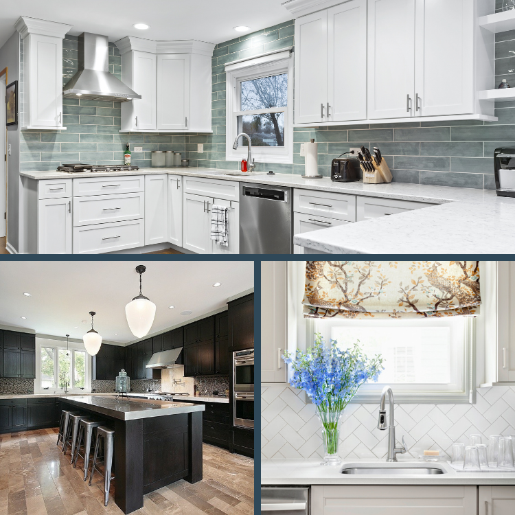
The power of tile patterns is real! Three different rooms, three different types of tiles, and a masterful use of pattern can be seen here. First, a subtle shaded green subway tile enhances the lines of a recent J&J project. The horizontal emphasis made the new kitchen feel larger and accented the elegance of the new cabinets and layout.
Below, a ceramic plank tile in a kitchen gives the look of real wood planks, while keeping cleaning and care to a minimum. The layout of the planks makes the room seem longer and works beautifully with the kitchen island. Last, installing the white tiles on a diagonal pattern breaks up a smaller kitchen’s backsplash area – making it seem larger.
We love all the subtleties of tile patterns and how they can transform spaces in both bold and subtle ways! We’re happy to talk about these types of details in a virtual consultation – Schedule one with our team today!

